
Website
September 17, 2026
Accessibility Isn't Optional: Designing Websites Everyone Can Use
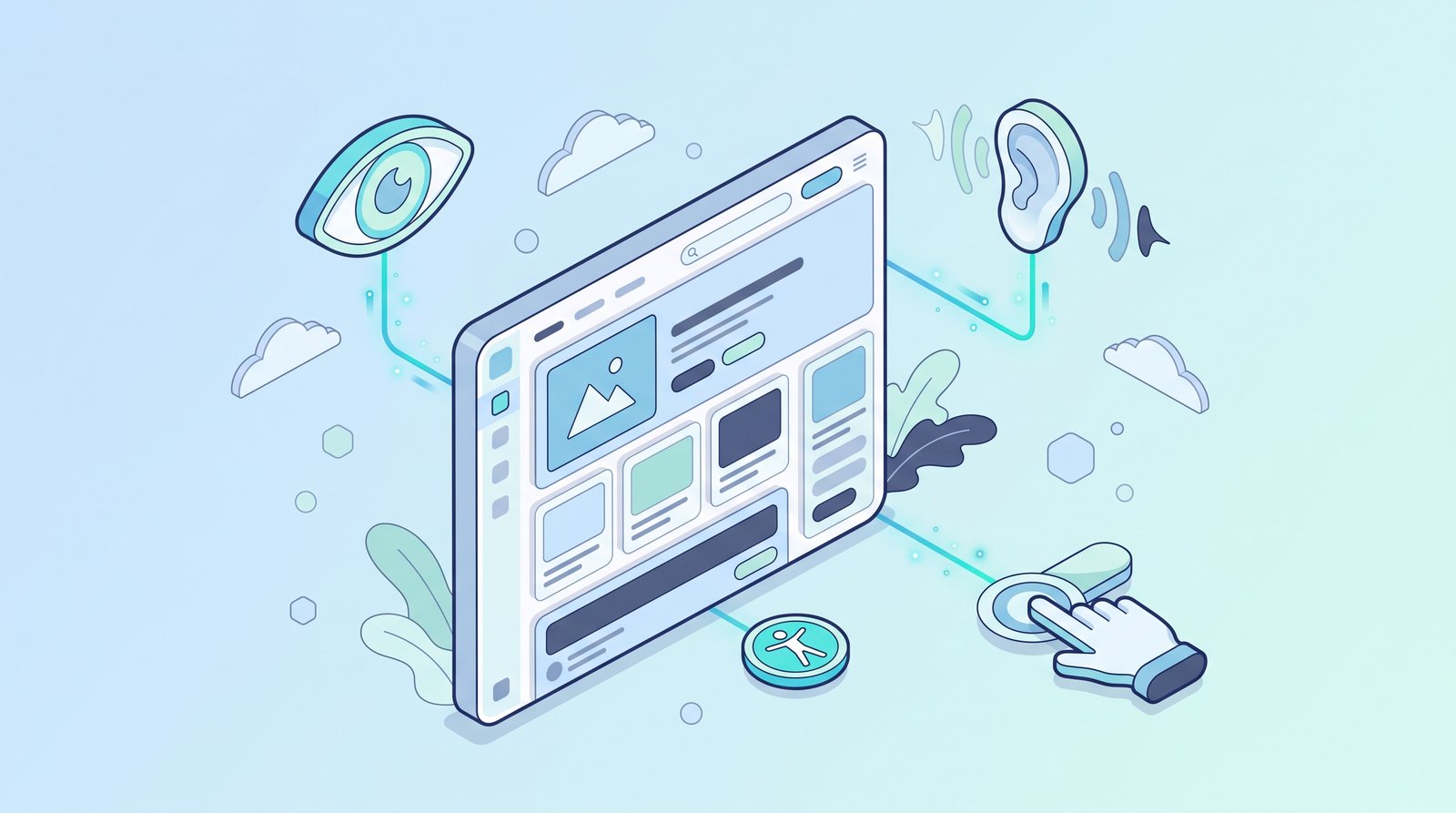
A significant portion of internet users navigate the web with some form of disability — visual, auditory, motor, or cognitive — and for many of them, a poorly built website isn't just an inconvenience, it's a genuine barrier that prevents them from using the site at all. Accessibility in web design isn't a niche technical checkbox reserved for specialized situations. It's a fundamental design consideration that determines whether a meaningful share of potential visitors and customers can actually use a business's website in the first place.
Why This Gets Treated as Optional (And Why That's a Mistake)
Accessibility often gets deprioritized because its absence doesn't produce an obvious, visible failure the way a broken layout or a slow-loading page does. A site with poor accessibility still looks and functions fine for the majority of visitors who don't rely on assistive technology — which makes the problem easy to overlook entirely, right up until it directly excludes a real visitor trying to use the site, or triggers a legal compliance issue, both of which represent real, avoidable business costs.
What Web Accessibility Actually Covers
1. Visual accessibility Sufficient color contrast between text and background, text that can be resized without breaking the layout, and content that doesn't rely purely on color alone to convey meaning (since colorblind visitors may not perceive color-based distinctions the way a sighted, non-colorblind visitor would).
2. Screen reader compatibility Proper semantic HTML structure, descriptive alt text for images, and logically ordered content that a screen reader — software that reads a webpage aloud for visually impaired users — can accurately interpret and navigate, rather than encountering a confusing or incomplete reading of the page.
3. Keyboard navigation The ability to navigate an entire website using only a keyboard, without requiring a mouse — essential for visitors with certain motor impairments who cannot use a mouse precisely, or at all.
4. Clear, understandable content structure Content organized with genuine logical hierarchy, plain and clear language where possible, and consistent, predictable navigation patterns — all of which particularly benefit visitors with cognitive disabilities, but genuinely improve usability for every visitor.
5. Captions and transcripts for audio and video content Any video or audio content needs text alternatives — captions for video, transcripts for audio — for visitors who are deaf or hard of hearing, and this benefits hearing visitors too, particularly in sound-off browsing contexts common on mobile devices.
Why Accessibility Benefits Every Visitor, Not Just Those With Disabilities
This is one of the most important and underappreciated aspects of accessible design: the specific accommodations that make a site usable for visitors with disabilities frequently improve the experience for every visitor. Clear color contrast helps someone using their phone in bright sunlight, not just someone with low vision. Captions help someone watching a video in a quiet office without headphones, not just someone who is deaf. Clear, logically structured content helps every visitor process information faster, not just visitors with cognitive disabilities. Accessibility isn't a separate, niche design consideration — it's fundamentally good design practiced thoroughly.
The Business Case Beyond Ethics
A genuinely larger addressable audience A meaningful share of the population has some form of disability that affects how they browse the web — a site that's difficult or impossible to use for this audience is directly excluding a real, sizable group of potential customers, not a negligible edge case.
Meaningful SEO benefits Many accessibility best practices — clear semantic structure, descriptive alt text, logical content hierarchy — directly overlap with practices search engines also reward, meaning accessibility improvements frequently improve search visibility as a genuine side benefit, not a separate, unrelated investment.
Real legal and compliance considerations Depending on jurisdiction and business type, web accessibility increasingly carries genuine legal requirements and compliance risk — treating it proactively is a meaningfully lower-cost path than addressing it reactively after a complaint or legal issue arises.
Stronger brand reputation and genuine trust A business demonstrably designing for genuine inclusivity signals broader values and care that resonate with customers well beyond the specific visitors directly benefiting from the accessibility features themselves.
Common Accessibility Mistakes Worth Fixing First
Insufficient color contrast Light gray text on a white background might look stylish and modern, but it can be genuinely difficult or impossible to read for visitors with low vision — checking contrast ratios against established accessibility guidelines is a quick, high-impact fix.
Missing or unhelpful alt text on images Images without descriptive alt text are effectively invisible to a screen reader user, meaning they miss content that sighted visitors take for granted — writing genuinely descriptive alt text for meaningful images is a straightforward fix with real impact.
Relying on color alone to convey information Using only color to indicate an error, a status, or a required field (a red border with no accompanying text or icon, for example) excludes colorblind visitors who may not perceive the intended distinction — pairing color with text or icons solves this cleanly.
Poor keyboard navigation Interactive elements that can't be reached or activated using only a keyboard exclude visitors who rely on keyboard navigation due to motor impairments — this is often an easily overlooked gap that only becomes apparent when a site is specifically tested this way.
Auto-playing audio or video with no easy way to pause Beyond being a general usability annoyance, this can be genuinely disruptive or disorienting for visitors using screen readers, which may attempt to read page content aloud simultaneously with unexpected auto-playing audio.
A Practical Starting Point for Any Business
Full accessibility compliance can feel like an overwhelming standard to meet all at once, but meaningful progress doesn't require solving everything simultaneously. A practical starting point: check color contrast on key pages, add genuine descriptive alt text to important images, test whether the site can be navigated using only a keyboard, and ensure any video content has captions available. These changes alone address some of the most common and impactful accessibility gaps, and each can be tackled incrementally rather than requiring a complete rebuild.
The Broader Design Philosophy This Represents
Designing for accessibility from the start, rather than treating it as an afterthought bolted onto a finished design, tends to produce genuinely better design overall — clearer hierarchy, more legible content, more intuitive navigation. Accessibility constraints, rather than limiting good design, frequently push design toward greater clarity and usability for absolutely everyone visiting the site, disability or no disability.
#webdesign
#accessibility
#inclusivedesign
#ux
#digitalmarketing