
Design & Branding
September 2, 2026
Editorial Layout Design: Lessons From Print Applied to Digital
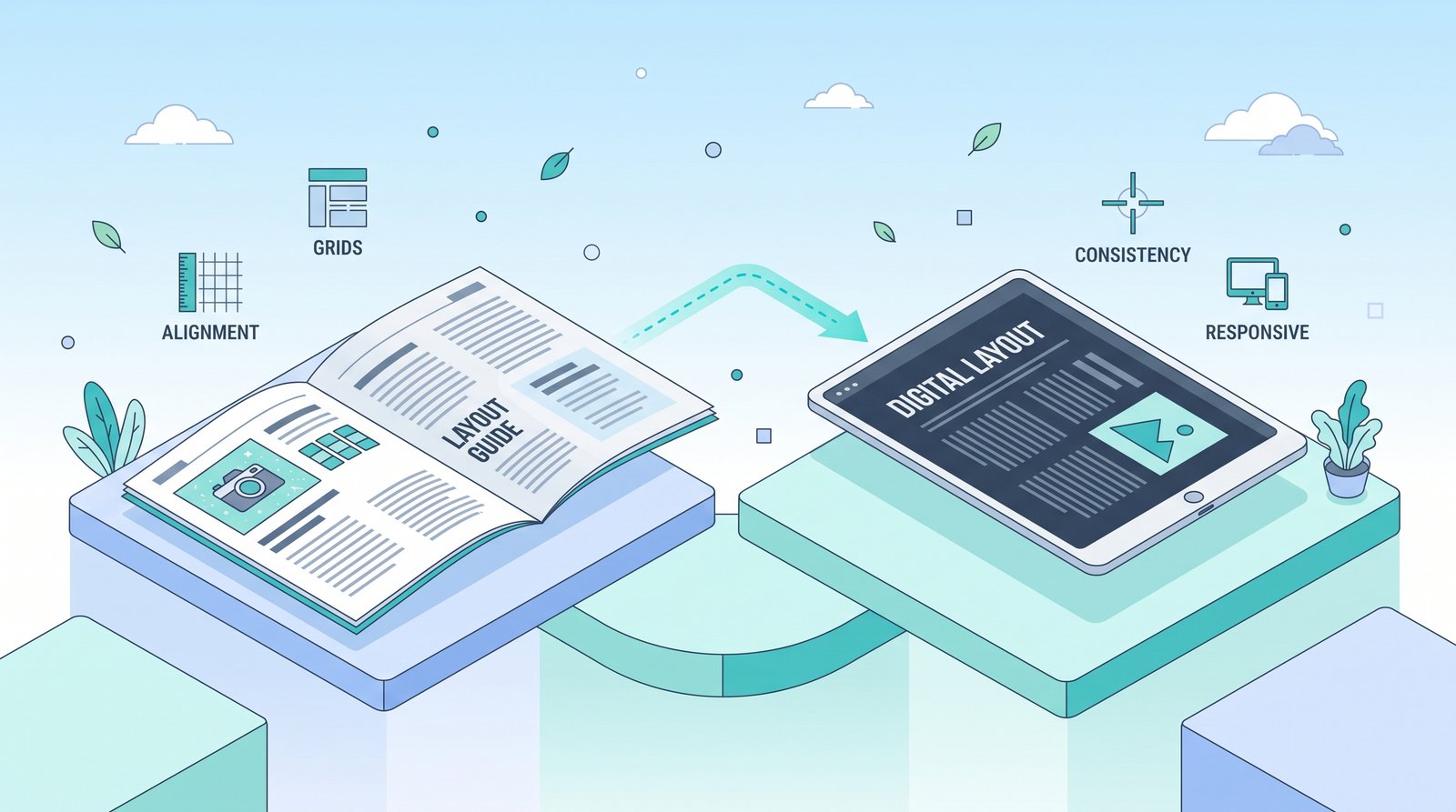
Long before websites existed, magazine and newspaper designers spent decades solving a problem digital designers are still working through today: how to organize large amounts of text and imagery into something a reader can navigate quickly, understand instantly, and actually want to keep reading. Editorial design — the discipline behind print magazines and newspapers — offers a mature, battle-tested set of principles that translate remarkably well to websites and digital content, and most digital design would benefit from borrowing more of them.
Why Print Design Principles Still Matter in a Digital World
It's easy to assume print design is a separate, older discipline with limited relevance to screens. In reality, the core challenge is identical: guiding a reader's eye through a page in a deliberate order, communicating what matters most at a glance, and making dense information feel organized rather than overwhelming. Screens changed the medium; they didn't change how human attention and reading actually work.
Lesson 1: The Grid System
Print editorial design is built almost entirely on structured grid systems — invisible underlying frameworks that determine where columns, images, and text blocks align. This isn't a limitation; it's precisely what creates the sense of order and intentionality readers associate with polished, professional design.
Applied to digital: Websites without a consistent underlying grid tend to feel visually chaotic, even when individual elements look fine in isolation. Establishing a clear grid — consistent column widths, consistent spacing, consistent alignment — before placing content gives a digital layout the same structural confidence that makes a well-designed magazine spread feel effortless to navigate.
Lesson 2: Deliberate Visual Hierarchy
Editorial designers make constant, deliberate decisions about what a reader sees first, second, and third — through size, weight, color, and placement — rather than presenting all information with equal visual weight and hoping the reader figures out what matters.
Applied to digital: Many websites present headlines, body text, and calls-to-action with insufficient visual differentiation, leaving visitors to guess what's actually important on the page. Borrowing editorial hierarchy — a clearly dominant headline, a clear secondary level, body text sized for genuine readability — gives digital content the same immediate clarity a well-designed print spread achieves.
Lesson 3: Generous, Intentional White Space
Print editorial design treats empty space as an active design element, not wasted real estate to be filled. Margins, gutters between columns, and breathing room around images are deliberately calculated, because cramped layouts measurably reduce both readability and perceived quality.
Applied to digital: The instinct on websites is often to fill every available pixel with content, out of a mistaken belief that more visible information is automatically better. In practice, generous white space around key content — the same principle that makes a magazine spread feel premium rather than cluttered — consistently improves both readability and the overall sense of quality a digital layout conveys.
Lesson 4: Pull Quotes and Visual Breaks
Long-form print articles use pull quotes, section breaks, and varied layout rhythm to prevent large blocks of text from feeling monotonous, giving a reader's eye natural resting points throughout a longer piece.
Applied to digital: Long-form digital content — articles, blog posts, product pages — benefits enormously from the same technique: breaking up long text blocks with subheadings, callout quotes, or supporting visuals at deliberate intervals, rather than presenting one uninterrupted wall of text that discourages readers from continuing.
Lesson 5: Purposeful Image and Text Relationships
In editorial design, images aren't decorative afterthoughts dropped in wherever space allows — they're placed deliberately in relation to the text they support, sized and positioned to reinforce a specific point at a specific moment in the reading flow.
Applied to digital: Digital layouts frequently treat images as generic visual filler rather than functional communication tools tied to specific content. Placing images with the same deliberate purpose editorial designers use — directly supporting the nearby text, sized to match its importance — makes digital content feel considered rather than assembled.
Lesson 6: Consistent Typographic Rhythm
Editorial design maintains a consistent typographic system throughout an entire publication — the same heading styles, the same body text treatment, the same caption style — issue after issue, which is precisely what makes a familiar magazine feel instantly recognizable even before a reader consciously registers the content.
Applied to digital: A website (or a consistent series of blog content, much like this one) benefits from the same discipline — consistent heading styles, consistent body text treatment, consistent caption and callout formatting — applied uniformly across every page, rather than each page inventing its own slightly different typographic approach.
Why This Combination Works So Well for Content-Heavy Sites
Businesses publishing regular content — blog posts, articles, resource guides — are, in effect, running a small publication, whether or not they think of it that way. Applying real editorial design discipline to that content transforms it from "text on a webpage" into something that reads with the same clarity, rhythm, and visual polish as a well-produced print publication — which measurably affects how long visitors stay engaged and how credible the content feels.
A Practical Way to Apply This to Your Own Content
Before publishing your next piece of long-form content, run it through an editorial lens: Is there a clear grid or consistent structure underlying the layout? Does the hierarchy make it instantly obvious what matters most? Is there enough breathing room around text and images, or does it feel cramped? Are long text sections broken up with genuine visual rhythm, not just occasional bold text? Answering these honestly, borrowed directly from decades of print editorial refinement, often reveals quick, high-impact improvements to content that otherwise feels flat or hard to navigate.
The Underlying Principle Worth Remembering
Good design discipline doesn't expire when the medium changes. Editorial design solved the problem of organizing dense information for human readers decades before the web existed — and much of that hard-won knowledge remains directly, practically useful for anyone designing digital content today, whether that's a website, a blog, or a full brand content system.
#editorialdesign
#digitaldesign
#ux
#layouttips
#graphicdesign