
Website
October 1, 2026
The Anatomy of a Website That Converts: A Section-by-Section Breakdown
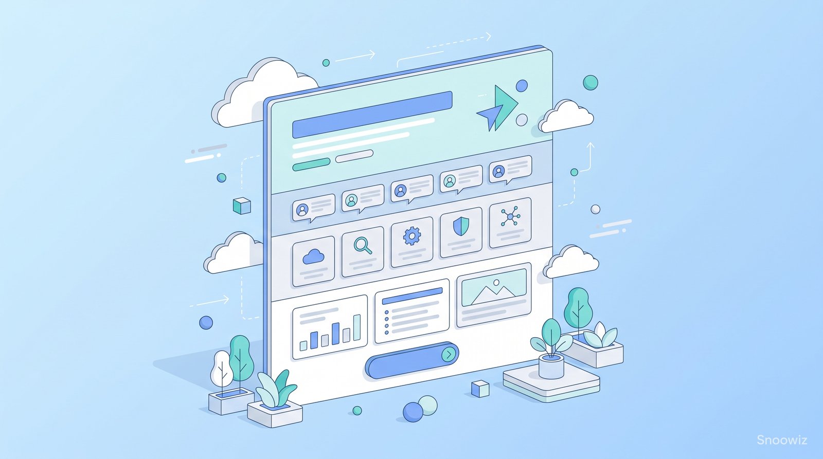
A website that genuinely converts visitors into leads or customers isn't an accident of good visual design alone — it follows a deliberate structural logic, section by section, that guides a visitor from initial arrival through growing understanding and trust, toward a clear, specific action. Understanding this underlying anatomy, rather than treating page structure as an arbitrary creative decision, is what separates a website that merely looks good from one that actually performs.
Why Section Order and Purpose Matter More Than Individual Design Choices
Each section of a well-structured page has a specific job to do in moving a visitor along a psychological journey — from initial attention, through growing interest and trust, to a specific action. A page with beautiful individual sections that don't follow this logical progression often underperforms a more simply designed page that nails the underlying structural sequence, because conversion is fundamentally about guiding a visitor's psychological journey, not simply presenting attractive content in isolation.
Section 1: The Hero Section
Its job: Immediately communicate what the business offers, to whom, and why it matters — within the first few seconds of a visitor's attention, before they've scrolled at all.
What it needs: A clear, specific headline (not vague or clever at the expense of clarity), a concise supporting statement, and a visually prominent primary call-to-action — all visible without requiring any scrolling.
Common mistake: A hero section optimized purely for visual impact — a striking image or elaborate animation — without equally prioritizing immediate clarity about what the business actually offers, leaving visitors visually impressed but genuinely unclear on the actual value proposition.
Section 2: The Trust and Credibility Section
Its job: Address the natural skepticism a new visitor brings, before asking them to invest further attention or take any action — establishing that this is a legitimate, credible business worth their continued attention.
What it needs: Social proof in some genuine form — client logos, testimonials, review scores, relevant credentials or certifications, meaningful usage statistics — positioned early enough to address skepticism before it causes a visitor to leave.
Common mistake: Burying credibility signals far down the page, after a visitor has already had the opportunity to form doubt and leave, rather than addressing trust early in the visitor's journey through the page.
Section 3: The Problem and Solution Section
Its job: Demonstrate genuine understanding of the specific problem a visitor is facing, before presenting the business's offering as the solution — this sequence matters because visitors connect more strongly with an offering once they feel genuinely understood first.
What it needs: Clear, specific articulation of the actual problem or need the target audience experiences, followed by a clear explanation of how the business's offering directly addresses it.
Common mistake: Jumping straight into describing features or offerings without first establishing genuine understanding of the underlying problem, which can make the offering feel generic or disconnected from the visitor's actual, specific situation.
Section 4: The Features and Benefits Section
Its job: Explain specifically what the business offers and, more importantly, translate those features into genuine benefits the visitor will actually experience — features alone rarely motivate action; benefits do.
What it needs: Clear, scannable presentation of key offerings, each explicitly connected to a genuine benefit or outcome, rather than simply a list of features presented without translation into actual value to the visitor.
Common mistake: Listing features in purely technical or internal business language, without translating each one into a clear, relatable benefit the visitor would actually recognize and value in their own terms.
Section 5: The Social Proof and Testimonials Section
Its job: Reinforce trust more deeply through specific, genuine examples of real customer experiences — building on the lighter credibility signals established earlier in the page with more substantial, specific evidence.
What it needs: Genuine, specific testimonials (ideally with real names, photos, or identifiable details rather than vague, generic quotes), case studies, or concrete results that provide substantive, credible evidence rather than a generic trust signal alone.
Common mistake: Using vague, generic-sounding testimonials that could plausibly apply to any business, rather than specific, detailed accounts that feel genuinely credible and relevant to a visitor's own specific situation.
Section 6: Addressing Objections and Frequently Asked Questions
Its job: Proactively address the specific hesitations or questions a visitor is likely still holding at this point in the page, before those unaddressed concerns become a reason to leave without taking action.
What it needs: Direct, honest responses to the genuine, common objections or questions a target audience actually has — pricing concerns, implementation questions, comparison to alternatives — rather than avoiding harder questions entirely.
Common mistake: Omitting this section entirely, leaving genuine visitor hesitations unaddressed and allowing them to become a silent reason for visitors to leave without ever raising the question directly.
Section 7: The Final Call-to-Action Section
Its job: Provide one final, clear, low-friction opportunity to take action, positioned for visitors who've read through the full page and are now genuinely ready, rather than relying purely on the initial hero section's call-to-action alone.
What it needs: A clear, specific, and ideally low-friction next step — with any remaining uncertainty or hesitation already addressed by the preceding sections — rather than a vague, generic prompt with no clear sense of what happens next.
Common mistake: Ending the page without a clear final call-to-action at all, assuming the earlier hero section's prompt alone is sufficient for visitors who've engaged with the entire page and are now in a genuinely different, more informed psychological state than they were at the very top of the page.
Why This Structure Works: The Underlying Psychological Logic
This section sequence isn't arbitrary — it follows a deliberate progression: capture attention and communicate value immediately, establish basic credibility before asking for deeper engagement, build genuine understanding and connection around the actual problem being solved, translate the offering into real benefits, reinforce trust with substantive evidence, address remaining doubts directly, and finally provide a clear path to action once a visitor has been genuinely, thoroughly guided through this entire journey.
Adapting This Structure to Different Business Types
This general framework applies broadly, but the specific emphasis and depth of each section should genuinely reflect what matters most to a given business's actual audience — a complex B2B service might need a more thorough objections and FAQ section, while a straightforward consumer product might weight visual features and social proof more heavily. The underlying structural logic remains consistent even as the specific depth and emphasis shift to match a given business's actual situation.
A Practical Way to Audit Your Own Website's Structure
Walk through your own homepage or primary landing page section by section, and for each one, ask honestly: what specific job is this section doing to move a visitor forward, and is it actually doing that job effectively? A page where any section's purpose isn't immediately clear, or where a section is missing entirely relative to this framework, often reveals a specific, addressable gap in the overall conversion structure.
The Bottom Line
A website that genuinely converts isn't simply a collection of attractive, well-designed sections — it's a deliberately sequenced journey that guides a visitor's attention, understanding, and trust toward a specific action, step by step. Understanding and applying this underlying structural logic is what separates websites that merely look professional from websites that actually, measurably perform.
#snoowiz
#webdesignstrategy
#leadgenerationwebsite
#uxdesign
#websitesections