Get in touch
I'm always excited to take on new projects and collaborate with innovative minds.
Phone
Email
Instagram
I'm always excited to take on new projects and collaborate with innovative minds.
Tailwind CSS has quickly become a favorite among web developers for creating responsive and modern user interfaces efficiently. Its utility-first appr...
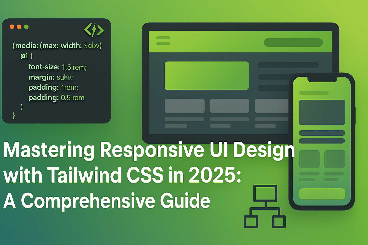
Tailwind CSS has quickly become a favorite among web developers for creating responsive and modern user interfaces efficiently. Its utility-first approach streamlines the styling process, enabling developers to build clean, responsive UIs rapidly. This guide provides detailed insights into mastering responsive design using Tailwind CSS in 2025.

Understanding Responsive Design Principles
Tailwind CSS is a highly customizable, utility-first CSS framework designed to build responsive websites effortlessly without leaving your HTML markup.
Install Tailwind CSS via npm or yarn, and configure your `tailwind.config.js` to customize themes, breakpoints, and plugins as needed.
Utilize Tailwind's extensive set of utility classes directly within your HTML to create responsive, clean layouts without custom CSS.
Tailwind provides responsive prefixes (e.g., `sm:`, `md:`, `lg:`) to easily handle different screen sizes. Learn how to strategically apply these prefixes to your designs.
Use flexbox and utility classes to craft navigation bars that adjust seamlessly across devices.
Implement responsive grids using Tailwind’s intuitive grid system. Adjust columns and spacing dynamically to optimize your layout.
Control typography responsively using Tailwind’s sizing utilities, ensuring readability across all devices.
Learn how to create custom utility classes for frequently used styles, ensuring consistency and efficiency.
Enhance Tailwind’s capabilities using plugins like Tailwind Forms and Tailwind Typography, providing additional responsive design functionalities.
Explore examples of popular websites and applications leveraging Tailwind CSS effectively for responsive UI design.
Stay updated with emerging features, custom utilities, and responsive design enhancements offered by upcoming Tailwind CSS updates.
Mastering responsive UI design with Tailwind CSS positions you to deliver visually compelling, accessible, and user-friendly interfaces efficiently. Embrace Tailwind’s powerful features and best practices to excel in responsive web development in 2025.
Your email address will not be published. Required fields are marked *


